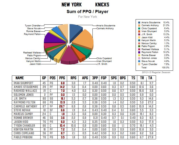
A big thanks to Patrick for making these charts. So we’ve been talking about how the Knicks offense is predictable when Melo and/or JR is on the floor and stagnant when they are off. And this chart would be even more skewed if you consider Amare missed 53 games last season. This breakout of team scoring pretty much sums that up:
Now lets take a look at that when compared to the two teams that made the finals last year. First the Miami Heat:
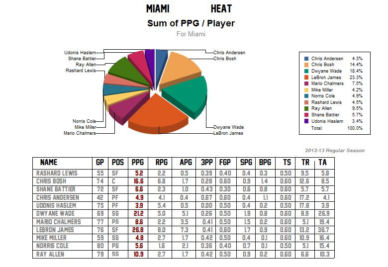 The big three dominate the scoring but after that pretty much everyone else on the team has the same threat of scoring.
And now the Spurs:
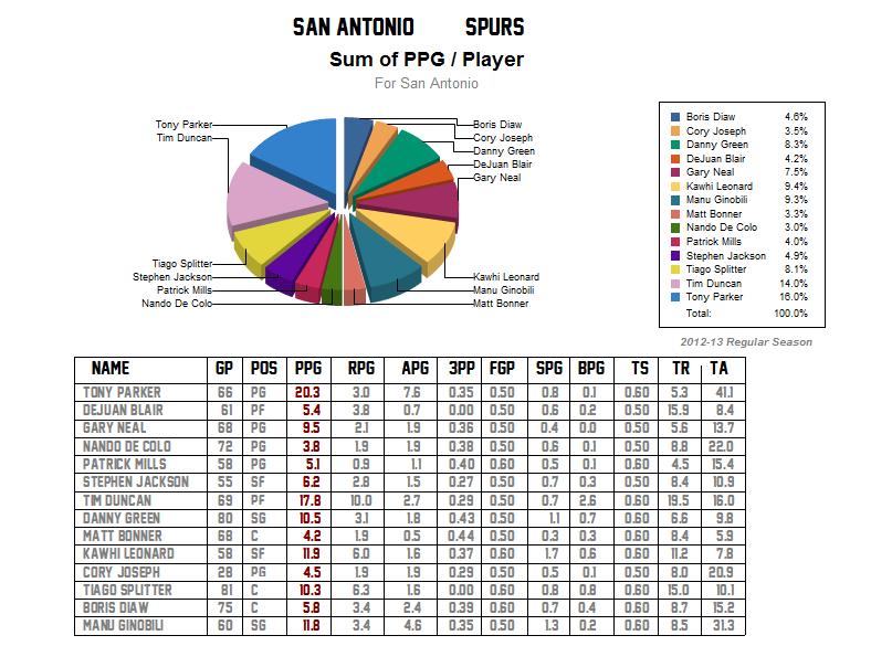 That distribution is a thing of beauty. You don’t know where the scoring is coming from. Lets hope the Knicks get a little more creative on offense this season.
